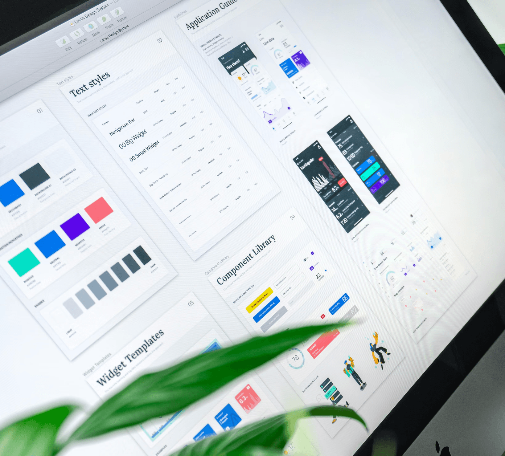
My contribution to Expand Strategy
How I manage UX to Product Design pivot to enhance sales and increase product discoverability
Transitioning from the role of UX designer to that of Product Designer allowed me to rethink our approach to improving sales and increasing the discoverability of our product. Initially, the UX approach focused primarily on the simplicity of user journeys, which, while crucial, did not highlight the full range of features our product offered.
One of the major issues encountered was that certain key features were too deeply buried in the information hierarchy. For example, some key actions were only accessible through several layers of menus, making their use unintuitive for new users. This lack of visibility limited engagement and, consequently, the adoption of our product. An overly minimalist design, though aesthetically pleasing, also contributed to this functional invisibility.
To overcome these challenges, I adopted a more holistic approach to product design. We interviewed clients and prospects to identify the most attractive features that were too deeply buried in the navigation. Based on this analysis, I redefined the information hierarchy to make essential features more accessible. For example, we created a persistent action and quick access bar on each page, making them immediately visible and accessible, which significantly increased their use. However, we also allowed users to hide these features if they wished.
At the same time, the design was revised to balance aesthetics and functionality. A more intuitive and less minimalist design was implemented, with clear visual elements and indicators to guide the user towards the main features. We also integrated more interactive elements and contextual guides to assist users in discovering the product.
This transition had a significant impact on the increase in leads and contract signings. Users also quickly adopted the highlighted features, which not only improved their satisfaction but also increased the conversion rate from demonstrations to license purchases. Positive user feedback and data analysis confirmed that this balanced approach between aesthetics and utility better met user needs and the company's business objectives.
Other EXPERIENCES
Other EXPERIENCES
Other EXPERIENCES
Other EXPERIENCES
Other EXPERIENCES


